

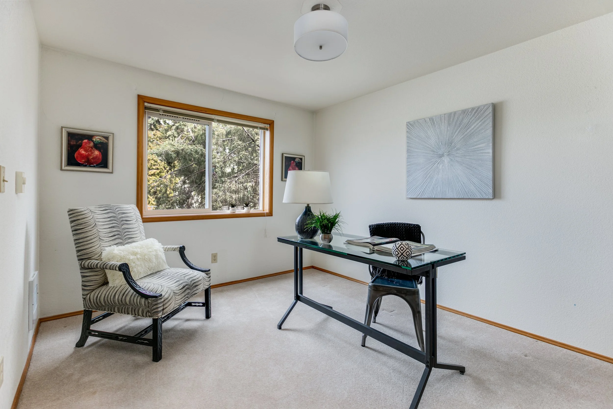
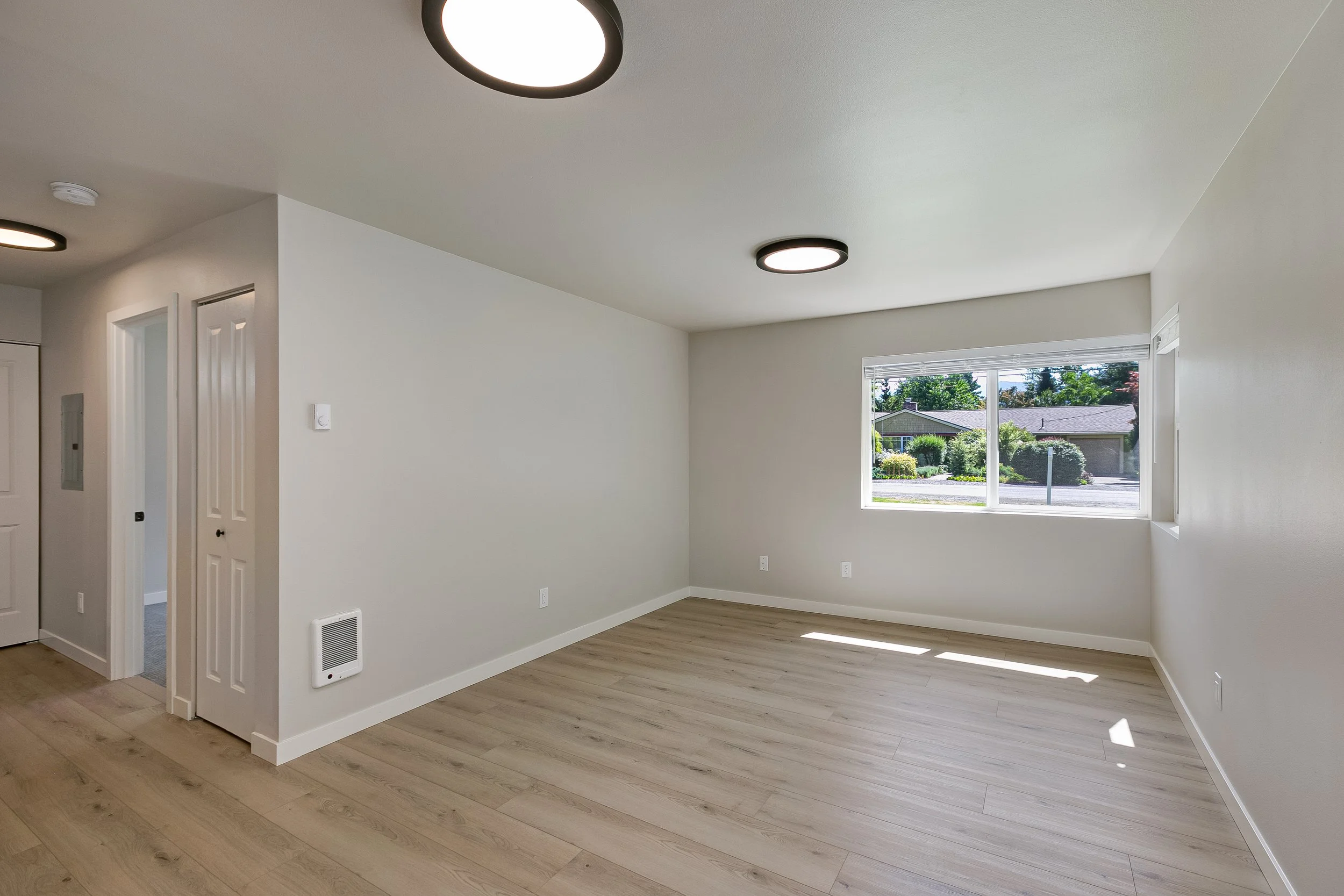
Your images will be on the left.
My images will be on the right.
You can use the slider to see both.
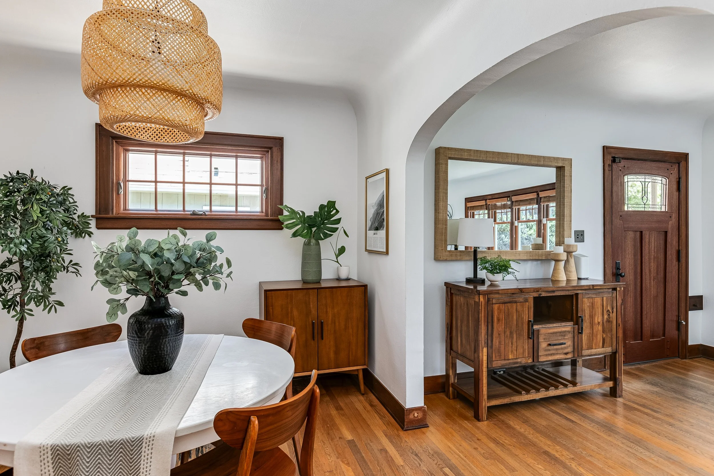


All of these images came out amazing. Thank you so much! I wanted to give some examples of what’s looking good so we both know what’s working.
The images after this are all corrections where I think we can improve - which is the best part about what we do. I don’t know about you, but I always look forward to constructive criticism to learn how to get better.
Again, thank you so much for all of your work. Been really enjoying it lately.

On this one I had to pay for another company to do rush edits to make the water darker. I didn’t have time to re-edit, because I had another photoshoot the next day.

On this one I removed the flash reflection in the top left of the glass window.


I thought the sky was darker than the highlights in the grass - which could never actually happen.
So on this one I brightened the sky and darkened the grass.


This one looked pretty close. I just think the brick area around the door could look a little better. But overall pretty darn good! Thank you :)


I felt like the exteriors on this one missed the mark a little bit. They seemed like a very strong HDR look that was not realistic. I know it’s difficult in the harsh sunlight, but sometimes it works to hand blend some areas of the photos.


On these we have to make sure the interior has the same color. I know this one was crazy because of the lighting difference. It was a difficult one, but I had to make it the same.
Sometimes when I’m working with businesses like this they don’t give much time. They were just about to open this new store for the first time. They were very busy, and I had to leave so they could open. That’s why there are not flashes inside for this angle. Even so, I have to make sure the color matches the other images so when they are posted together it will look like a cohesive collection.
Mine has too much cyan. I like the warmth you have in the exterior.


These images are great. Thank you so much. Really good work on this one. I’d love it if we can get to this quality for every project. There may be a few verticals here to watch out for, but this is really really good work. If we can maintain this quality I can start to try to go after more projects like this that are not only real estate. Thank you!


The natural sky looked great that day, and it helps the trees look better.


I also think the light from the flash might have fixed the ceiling above the fan.


Probably somewhere between these two is best. I felt like the colorcast was strong in a lot of the edits from this house.


You can see some minor changes here near the lamp. I think I brought the dark areas up a little bit too. Obviously I cropped as well.
Very small changes. I great edit overall. Thank you.
Now that I look at it again, I can’t really even see the difference. Great work!


This is also very subtle, but I use the blacks, a curve, or the midtone slider in photoshop to get some darker blacks when I’m outside. I also brightened the interior of the shed a little bit. Yours looks really good though. I’m just making small notes, because it’s always nice to communicate.


For this one I cropped some, but I also added some contrast and saturation. I always also dodge and burn with a brush.
I also like to darken the blacks in the images lately. However, I try to still make sure the windows don’t look black. On this one I didn’t take the time to fix it… but sometimes I sample the lightest blue part of the sky and paint it onto the windows at a 18% opacity. It helps give some life to the windows sometimes. Only when I have time.


These edits looked really good. On this photo I cropped it a little and brought some more contrast and blacks into the image for a stronger look. Not a huge difference. You have to have a really good monitor to see it. Great work!


For a home with some much white, I think it’s best to use “replace color” to make sure we get a nice white on the wall and ceiling. Clients will complain if the color is not right when it’s white.


For this one, I used replace color on the walls, made the bathroom brighter, removed the rest of the cord in the wall and fixed the area in the top left of the image.
I felt the way that the red piece was removed from the top of the image made it look like the roof was damaged. I can’t turn that in to my clients. This family spent a long time fixing this home to sell. I need to make sure it’s looking its best.


For most of the images, I used replace color to make sure the walls were white.


Your lights in this image look awesome. That’s a really really good look. Thank you.
I posted this one to talk about the dark areas. I think sometimes the blacks are too dark, especially in the windows.
Your sky and water looks a lot nicer though.


The shadows in this one are just a bit dark. I like to get some detail in the shadows. Photos like this will be hard because it was so sunny, and this is the best the drone can do.


This one just needs a little more saturation. You can really see it in the tables and the kitchen sink area.


Your image looks great. The only major thing I would change is that the other house in the window is ugly. We can let it be more bright so that people aren’t looking directly at the neighbor.
Your window looks really really nice, but in this case it is a style choice to leave it bright. If it was a nice view we can make it more clear like your edit.


You can see some difference here with the window and the saturation of the image.


This one is for the lamps. The lamp on the left is very bright. I would like to see some detail on the left lamp.
The right lamp has too much light going onto the wall and ceiling. I don’t like to show very bright areas next to lights.


This image is to show the difference in the back room and the lights over the table.
I removed some of the dark shadows on the ceiling in the back room and made sure that I still had detail in some of the bright kitchen areas.


This image looks awesome as well, but I felt the bench area was just a little bright. Honestly, your editing makes me so happy :)


Your image looks awesome. The only thing here is that we have to make sure that rooms don’t look dark - especially when it is a client that likes to have photoshoots with the lights off. I have some clients that like the lights off, but we still have to make sure the rooms are not dark.
Your colors are much nicer in this image.

Again, your image looks really really nice. Nothing much to change here :)
I wanted to share this one so you can see that I always remove furniture marks on the floor. Also that the window can be more colorful for this image.


Your image looked really great! I liked it even more than the one I shared here, but I wanted to share this photo to make sure we can get more detail in the lights when possible.


On this one the sky quality and the light on the wall could be cleaned up a little bit. It was close!


This one came out very dark and saturated. Some color replace for desaturation worked well. I also dodge a lot of the shadows and midtones to brighten it up.


In this one there is a lot of color from the lights, and you can see my reflection in the dark window.


I thought the ceilings looked dark here.


We can see the color differences here as well as brightening the ceiling in the living room. The chair colors as well.


This one is very close. Just be careful with the blue in the couch. You can tell by the quality of light that it is a window that is making it blue. I desaturate the blue in the couch. You can use “replace color.”


This one is also close. I think there is too much contrast. It makes the whites too bright. The blacks are also too deep.
For this one I burned the shadows with the “burn tool” in the areas I wanted to be darked. I burned the almost everything a little bit.
You can see the quality out of the window. Looks at how the trees have more color and show up better.


This one looks very good. You can see just a few of the highlights are too bright. Very small difference. Maybe a very small curves adjustment would help.


Below are adjustments I made to the image.


In the first slide, I think the edit looks “muddy”.
So I do a “replace color” and select the areas of the glass door that should be white. Then I desaturate that color and mask areas that I think need the adjustment. You can see the color I desaturated from the white areas.
Next, I made a curves layer. The image needed deeper blacks and some midtones adjustments. You can see how I changed the curves layer.
Finally, we have the layers so you can see what the file looks like.
The next one is how what it looked like after that fix.
The last image was what I edited on my own from the start. I hope this helps.


This one was too bright in the highlights. We are losing detail in the highlights. It was also very green/cyan.


This one was also too bright in some areas. We lose detail in the wood when it’s too bright.


This one was too bright in the highlights, and not dark enough in the shadows. We lose the details in the highlights, and we miss some color on the rugs.
I do not know how you are editing, but if you are doing flambient, maybe the ambient layer is overpowered. Can you opacitate it lower?


Again, very bright. We lose detail in the grass.


This one more for the color. You can really see the difference on the concrete ground and on the white part of the house.


We’ve already talked about this, but I think turning down the highlights is a good idea.
I used a separate layer to mask in the light in the yard as well as the light above the door. I also matched the windows. My shadows may be lighter in the trees. For a lot of my outside shots I manually dodge/burn some highlights/shadows/midtones in the areas that need it.
Because mine was made to be darker at night, I think the cool tone makes sense. The yard has also been adjusted a little.
I give these photos more attention, because this will be the FIRST photo people see of the home. The front always has to be our best image.


For this one, I made it more of a night shot. Just darkened it a bit and matched the windows…. My windows are a little extreme.
Your image is great, honestly.


Your image honestly looks great! Don’t mind the color difference. I thought it looked amazing, but the client requested that I remove the “golden hour” look…. whatever…
I think the main differences are the blacks and more saturation in the trees. Honestly, nothing to worry about. The one difference I think is nice is to take away the yellow by the front door.


Honestly, beautiful. The highlights are bright, but we already figured out that we will lower them a little bit moving forward.
Great work!
Oh, I fixed the grass a little bit. If you ever see it looking like that, I’d rather you fix it and send a second version (just like the fire place). Don’t make it perfect, but make it look like they water the grass instead of letting the grass be yellow.


Your image is way better. Great saturations. Well done 🙌 I like that we can see all of the detail in the mountains.
Sometimes when the mountains are very blue like that I remove some blue from them.


For this one I made the lights darker. I don’t really like the glow around them.
I also photographed these with the lights out, but I did not send them to you. Would that help in the future?
Your walls look a lot nicer. I work on two monitors and it really depends on which monitor I’m looking at. Your images look nice. Thank you.


I mostly changed the green color on the building and desaturated some of the color in the grass. I felt the whites were a little high in this one.


For this one, it was more of a sunset shot. The window lights are the clue. I will tell you next time when it’s a night shot. All of the ones with the lights glowing in the windows were sunset shots.
Also, I thought the colors on the home was too much. The whites were also bright.


This was a night shot as well. I darkened the image, did some color balance, and changed the sky.
If it was a day shot, your image looks wonderful :)


For this one I warmed the image, increased the saturation and dodges the house so that it was not so dark.
Your images was nice, but the front of the home is always the most important image. I edit the front of the homes until I think they look their best.


For this one I brightened, saturated and added contrast.
It is also cropped, but no worries there.


Your image looks great, but I thought a curve to add contrast worked well.


Great work!
I felt the room on the left was a little green. I used a “replace color” layer to desaturate the white areas.


Same here. I cleaned the color of the walls with a “replace color” layer.
I also tried to quickly get rid of some contrast by the bright lights. It is hard to tell.
Thank you so much for the great imagery.


Both of these images are mine. I wanted to show you how I like to do grass.
When I do grass/fires/TV I always edit the image first and save it. Then I add the grass at about 40% and save that.
The reason is because if they decide they don’t like the fake grass, then they can use the other image that is also edited.


These are both your images.
For this one, you can see that more editing was done to the house with the grass. This is a problem because if they think the grass looks fake, then they cannot use the original image because it has not been edited as good. So their only choice is to use a grass image that they may not like.
My style is to tone the grass back to about 40% or 50%. My client can get in trouble if it’s too different. Also, be careful going under the plants where there is no grass at all.


These are both very close. Great work. I just put some more saturation on the wood.


Your image is much better! Thank you.
For this one I would change the floor to be less red.


This one is mostly for the horizontal floor area. I straightened it.
Love the color on your image more :)


I brightened the image and ruined my sky. Your sky is better, but we need the image just a little more bright.
I also often +10 hue on the greens outside to get a nice color.
Sometimes bumping up the white on the outside shots works well (and then mask the bright lights). I think I did a curve layer here.

I brightened this image and added a little tint (maybe too much).
I also made the light on the left darker and less saturated. I thought it was a little distracting.
But I know you spent a lot of time removing snow and everything. I really appreciate that. It made the client super happy. I charge them extra for that and will add it to your tip when we get requests like that. Thank you very much.


I brightened the image and did some color work on the front. The image looked a little warm and brown/muddy.
That made my sky bad. Your sky is much nicer. Mine is too saturated and bright.


I adjusted the color and brightness on the right side of the image.


I did some color work on this one to get rid of some of the green areas - mostly in the mirror.


Great image. Looks about the same. I just did a little horizontal correction and changed the floor a bit.


I lightened the left side of the image. It looks like this lens correction is a little curved still. I do an automatic lens correction when I import into Lightroom, so I never have to press any lens correction buttons. It’s been working for me. Let me know if you’re interested in that. I don’t really know your process.
Great image! I probably wasted my time lightening the side of the image. Looks great.


I made some color adjustments on this one. It was a little brown looking. I think you can see it the most on the house and around the pool.


Awesome! These are almost the same. I just lightened the front door area a little bit.


I thought this image just needed some stronger blacks toward the bottom of the image.
Your sky is nicer.


I like your windows more. I think they could even be a little brighter because there is nothing nice to see outside. Just a little bit brighter.
We can see here that yours is a little warmer. If we end up like that it’s better than being too cool. I think the perfect color is somewhere between these two. The hallway is a little red.

Your image looks great. Really, I just have to share something so that we can both get better. Not much to change here. Your windows are much better.
The main difference is the color. I also brought some detail into the sink and floor area with the flash image. It is easy to see on my good monitor. It is hard to see on my bad monitor. Maybe nobody sees a difference.
Thank you for your amazing work.

This one looks a little too warm to me. We can really see that the rug is orange.
Your windows are MUCH better. Thank you.


Not too different. Awesome job.


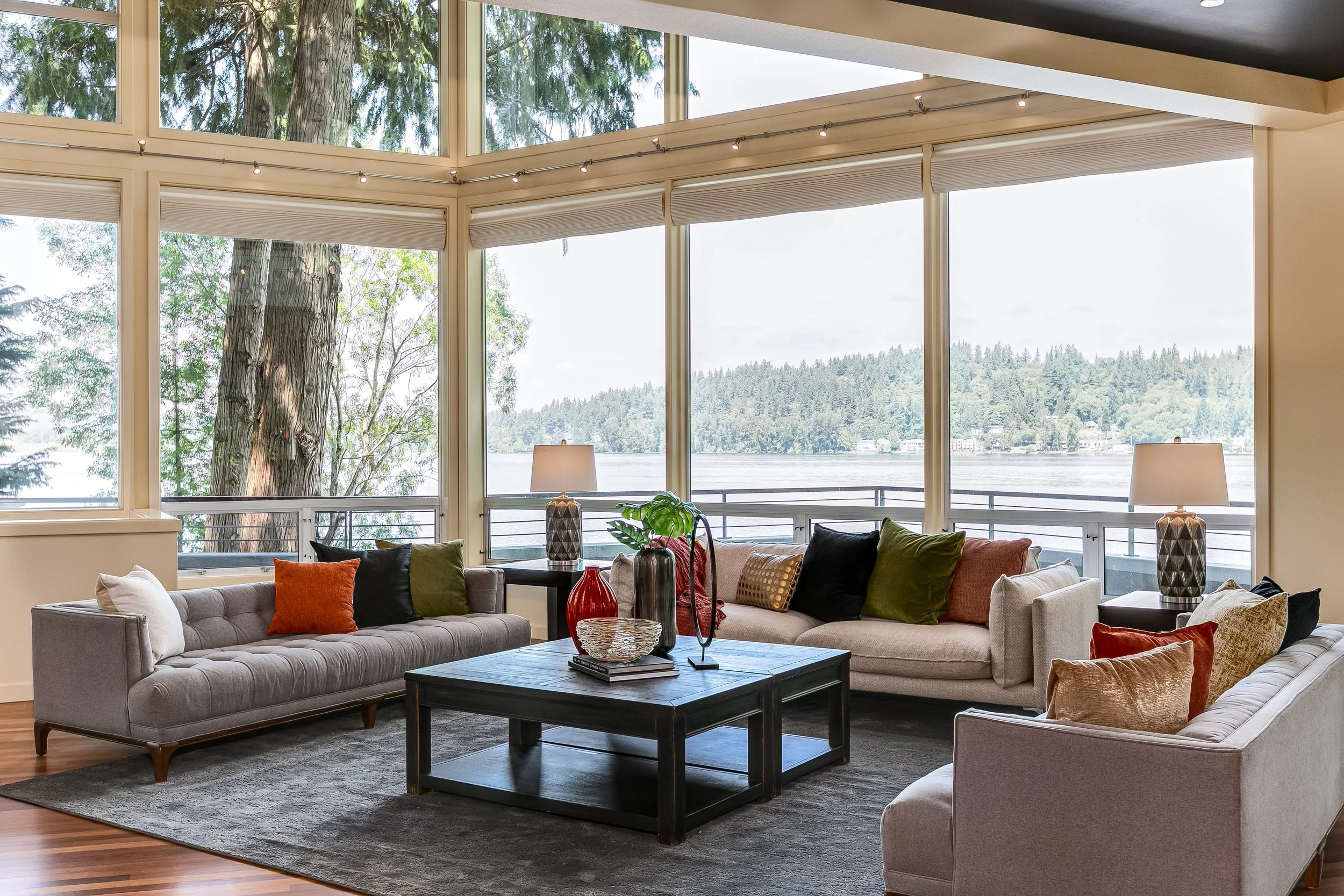
I think your image looks more realistic, and the light outside looks better…. but….
This lake is important for selling the home. I photograph a lot of homes on this lake. Whenever we can see a lake in the background through windows they need to be a little darker. If they come back too light, my client asks me to darken them.
So while I like your image more… I know they would ask me to make the lake darker.
For this photo edit your images were amazing! If they could come out like this every time I would cry from happiness! Thank you so much.


I wanted to say here that I like your window a lot better. There is not much to see outside, but the colors give a nice feeling.
Great work.
I think we need to watch out for the detail. The bed is just a little bright.


The main thing here is color accuracy.
I think a lot of the images are looking orange and green. Perhaps it’s helpful to duplicate the flash layer and paint in some areas.
Your sky looks better in this one. It looks very light and more natural and believable. Thank you.


I think the colors in this one are the main issue. The floor is looking green. I also think softer shadows by the toilet are nice.
Your detail/contrast in the wood is better. I just think the color is a little off.


The biggest difference here is the color detail in the bathroom and the lost of detail in the top of the pillows.


Perhaps using more of the flash in combination of desaturating the orange colors will help.
I like to get rid of the brightness on the wall as well as get a more accurate color on the floor and the curtains.
Your window brightness is nicer. Thank you.


For this one, there is some flash shadow behind the lights. I know in mine the mirror is dirty.
A big difference is also on the top left. There is a color shift that needs to be fixed. I also brought some more detail into the sink area.


Your lights in the kitchen came out really nice. Thank you very much.
The biggest difference in this photo is the color of the wall. We need to make sure the wall coloring is consistent. It’s look cool on the left side. It’s also looking a little green toward the kitchen.
Also, take a look at the color of the couch.


These images are both yours. Usually when I photograph one image with the lights off and one with the lights on…. it is so that you can use the image with the lights off to help remove the glow. I wanted to share that with you in case you see this in the future.
The image with the lights off came out a little bright, orange, and warm.


Your window and table looks so much better. Thank you very much :)
I like the kitchen sink more in the one I turned in to the client. The same for the ceiling light. Yours has a little glow to it.
I realize some images can’t be perfect, but these are the things I look for. The competition in my area is HUGE, so I need to turn in only the best.


For this one, you can see the color cast on the back of the chairs and in the kitchen. The images looks too warm/orange.
Let me know if there is anything I can do when photographing to help this. I use a flash on these shots to get better color, but sometimes I think we just have to desaturate areas in photoshop.


There are some areas in here where it is too bright on the light, plant, and in the kitchen. I like lots of light, but we still need to see the details when we can.
Also, by the stairs and the door the colors change. Please desaturate or lightly paint some color in the area to make it even. Color casts from lights need to disappear.


Your window looks nicer. I like that it has more light.
Your brightness on this one looks good too for the entire picture.
But for the inside, I think the plant and the light is too bright.


For this one, the stairs were bright. The detail was lost. I used the flash shot to bring back more detail in the stairs. The same for the colors.
The door also looks more straight.


This is beautifully done. Thank you so much. Yours is better. It’s perfect.

I don’t have a photo to compare right now, but we can see the grass is brown and there are people in the photo. The colors, sky and contrast are all amazing. Thank you :)


Your image looks SO GOOD! Wonderful sky, great colors and contrast. It’s got the feeling perfectly. I like your sky much better. My pink does work as well.
You can just notice some edits at the bottom of the photo. Whenever a driveway is wet or dirty I try to clean it… unless it’s a house that people do not take the time to clean for us. I fixed the bushes and the grass at the bottom too.


The colors and contrast on yours look really really good. Thank you. Mine is actually a different photo, but it’s the same idea.
I think we both missed it with the grass. Mine has a bunch of little lines running through it. I used a bad grass to replace with. I think the grass you used was too big. The blades are really big and needed to be much smaller. We also need to be careful that the lighting on the grass matches the image.
The one thing I did was to take extra care that the grass did not overlap concrete, or the dock. I used a brush instead of a polygon tool.
The polygon tool created some errors that needed to be fixed. I could not turn that in, because the clients would notice. This one was difficult, but it needs the time. This is how I get called to photograph big houses like this. I have to stay at the top level in the area or else they will call my competition.
I’m being very critical here, but I’m hoping that any information is helpful. It took me a long time to edit mine, but the clients were very happy.


I LOVE the sky that you chose. I think it was a smarter choice than mine. I also think your grass looks better than mine. Mine looks a little too perfect, while yours is nice and natural.
There’s just one little spot behind the pond that needed grass, and we have to be careful that the trees look real where they meet the sky. I don’t think anyone would notice, but we know. Great work!


We’re REALLY CLOSE on this one. That’s awesome!
I think the main difference is the sky choice. For this one I like something more blue so that the image has some different colors in it besides all warm tones. I also brought down the light by the garage.
Everything else is almost the same. That’s really awesome.


On this one I made sure to hide the stuff under the deck again and fixed the grass. One thing I did that helps… I darkened the house in the background that touches our house so that it was less distracting. That helps a lot sometimes. Makes our house stand apart. I cloned in some more roses in the rose bush on the right.


Your sky looked really nice. I think the main thing for me was that the sky was almost the same color as the deck. No problem. I just chose something different. Yours was great! Because I had a darker sky, I made the house darker so that it looked good. I think your brightness was good for the sky that you chose.
The most important thing here is that I chose to hide all of the trash underneath the deck in the shadows. We don’t want the people to see all of the storage underneath there. I also fixed the grass and removed some stuff on the side of the house. We can let the shadows be a little darker in this one to hide the stuff under the deck and also to prevent a harsh HDR look.
Your windows look really great, and I like how you toned down the brightest lights. That’s very important. Thank you :)


For this one I desaturated the blue in the shadow area and lightened that side. I darkened the other site to try to even it out a little bit but still looking realistic. Really it’s just me trying too hard, but I like it. Thank you for your edits :)


I removed the cords and brightened the ceiling a little bit. I tried to make it a little darker outside as well. I think there was some color on the walls from the lights. I cropped it as well and made that light above the door look on (the light above the door is hard to notice and doesn’t really matter.).


Not much change here. Mostly a crop. Well done!

On this one I removed some color from the walls and the cords. To remove the cords I pasted a big piece of wall from the left and painted it under the tv. It’s not perfect, but it was somewhat quick. For the image, they asked for it to look like a security camera… so I just put the back of the house on it.

I removed the cord on this image. When I remove the cords, I also remove any shadows that the cords create. I’ve seen images where people remove the cords and keep the shadows. It’s not a good look.


Added some sky here.


I added some sky to this one.


I saw a little bit of shadows from the flash on this one. I ran out of time and sent this to him, but on future jobs I want to make sure we don’t miss these.

For this one, I lightened up the inside - especially on the left side.


This one I went between the wooden pieces because I felt it need some improved grass there. It was time consuming. I also cleaned up the hose on the right, because I don’t like to show things like that laying on the ground.


For this one we want the grass to look better. We don’t want it perfect. We are helping the agent look better online. We don’t want a person to show up to buy the house and feel like they were lied to. Does that make sense?


The same for this one.


On this one I think we’re both very close. That’s awesome! I like your sky and green trees more. I like the darker blacks on mine. It really doesn’t matter. This one looked amazing. Thank you :)


For this one I lightened the trees a lot more. I think I dodged the tree midtones or highlights. I cannot remember. I also removed the blue from the land in the background. Both of our skies look about the same, so that’s good 🙌


Normally we like to see the inside of the home on the night shots. For this photo the idea was to see the reflection of the lake and sky. I thought it looked best that way.
Also, the color of the yellow on the left side of the image is different. Yours is more green while mine probably has more red.
I also went for a more dramatic sky and made the photo look a little later at night.
Your photo looks amazing! It’s just a different style than my style.


For this one, we can see the lights inside are a different color. I also got rid of some glare by the front door.
The sidewalk was looking dirty, so I cleaned that as well.
For the sky, there are a few things. Your sky is very beautiful, but I think it’s really close to the color of the inside lights. Sometimes I like to choose a sky that is more pink or some type of color that isn’t as close to the color of the lights. Or maybe if it was a little less saturated. I can also see that the sky goes over the roof and the chimneys. We also need to make sure that the sky looks close through that window. They are small details, but I do a lot of luxury homes. They ask me to edit again if it doesn’t look good.
I think your photo is really good, but a little different than my style. Very very close :)


My photo is cropped, but these look almost the same. That’s awesome! Looks like I just highlighted some of the plants and flowers more because they look good.


These are actually two different angles, but they are close enough to compare.
The quality of the photo you edited looks amazing and would make clients happy. Inside your window looks great! That makes me super happy 😆
The main thing here is the horizon. My horizon fades more, and you can ALMOST see the mountains. We can’t do any straight lines for the sky where I photograph because there are always mountains nearby. I usually fade the sky when it looks like this.
The other thing is that my leaves are more highlighted. I always go through the night photos and dodge and burn highlights and shadows manually to paint light where I need to.


Yours looks great!
Mine just has more contrast and a blue sky. I always need a blue sky outside. You can use the natural sky or a fake one, but for outside shots I always need a blue one.
When we are doing inside shots you can skip blue skies in smaller, tinier rooms. But if it’s a nice view through the windows we would need a blue sky.
Your photo looks great though. You can see I cropped mine.


I think here I have more contrast. Your dog in the window looks better lol. I didn’t see him until now.
I also painted that tree with a single layer to make sure the wind didn’t blow during the HDR. Maybe you did too. I don’t know.
I made sure to put a little more light near the seating area in the background too.